|
STILL MOTION:
STONE AS A NEW MEDIUM FOR GRAPHIC DESIGN
‘Still Motion’ is an exploration by 5 graphic designers into the use and meaning of an uncommon material in the field of graphic design: stone. Sagmeister & Walsh (US), Jonathan Barnbrook (GB), Ian Anderson (GB), Pedro Falcão (PT) and Jorge Silva (PT) are invited by experimentadesign to explore and innovate the use of Portuguese marble and limestone.
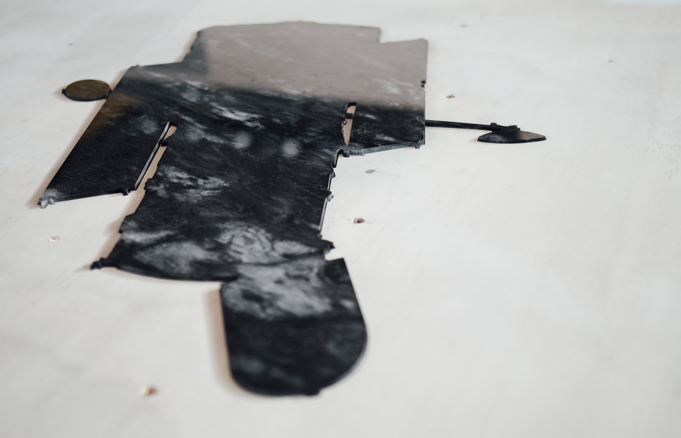
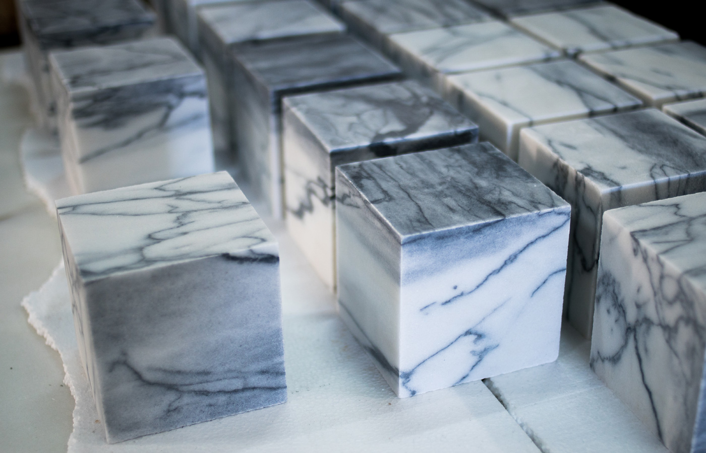
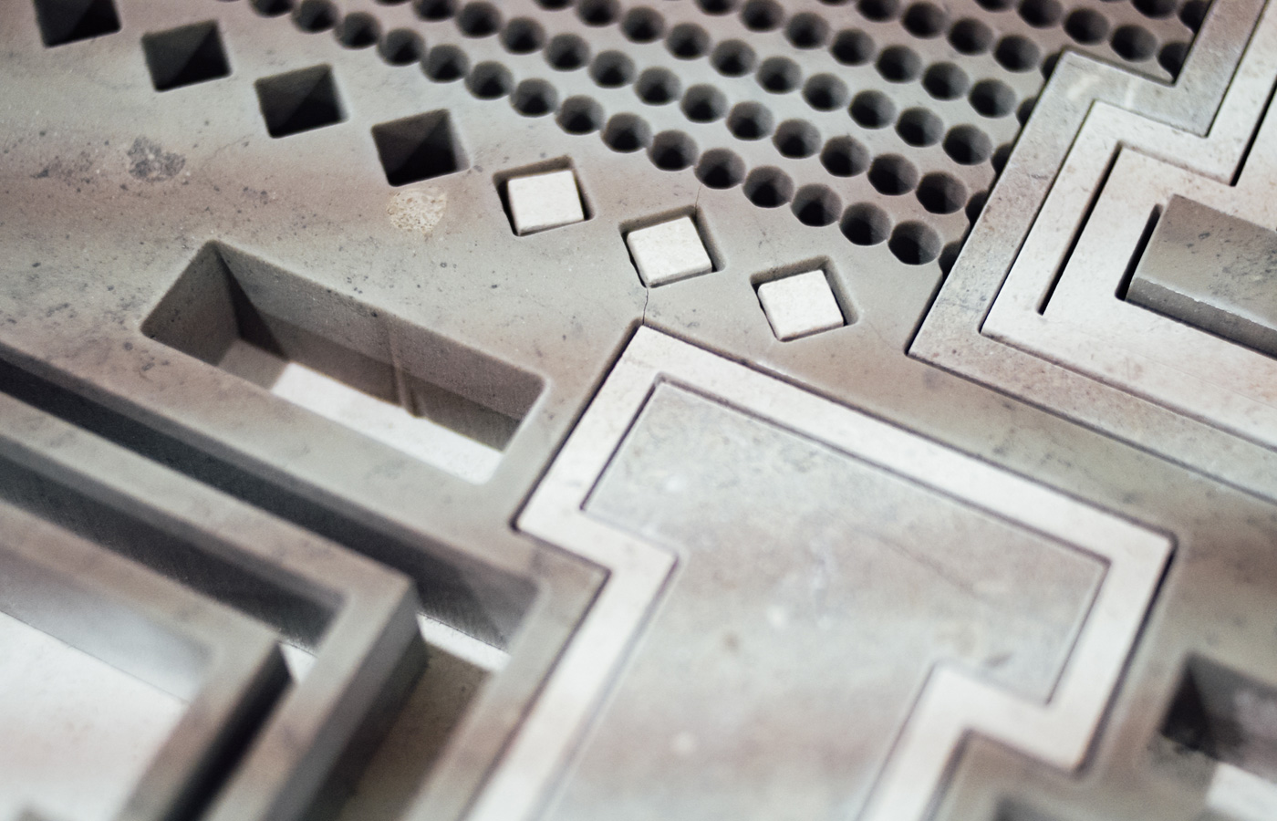
An autonomous interpretation is presented by the designers, in which they pursue possibilities for stone as a new communication medium. From a graphic design perspective the use of stone is expanded by a close collaboration with the industry. In the process, traditional methods and new technologies are combined to stress the visual characteristics of stone in terms of colour and texture. The resulting 5 projects cover a variety of ideas: ranging from objects that question contemporary philosophies, our notions of reality and subconsciousness, to signage panels and a homage to constructivism that permeates into the realm of art. All expressed through stone. The exhibition is on display from March 30 – April 9, at the Triennale di Milano during Milan Design Week. ‘Still Motion’ is part of the ‘First Stone’ programme, which is an initiative of experimentadesign and Assimagra, the Portuguese association for mineral resources. The project is curated by experimentadesign’s director, Guta Moura Guedes. It presents an unconventional approach to the use of stone, where a 3D material is interpreted by experts from a design field that work mainly in 2D. The designers received a briefing in which the beauty and presence of stone in public and private spaces is explored. This by making use of the versatility of the material in terms of their visual characteristics. Whereas stone is inseparably linked to the fields of architecture, art and even product design, its meaning in graphic design remains undiscovered. Artistic freedom is paramount to this project, broadening the potential of the material. ‘Still Motion’ deepens the relationship between the material, design and the industry. On all levels the boundaries are pushed. New perspectives and working methods arose in the process. PRODUCTION METHODS In different ways, each of the five projects highlight the specificities of the material’s attributes, depending on the geological origin and composition of the stones. The designers have appropriated several traditional and technological stone-working techniques, including stone inlaying with high precision waterjet cutting. Some of the pieces have been shaped using laser engraving, a technique that is usually applied to other materials, but that has now been used for stone. Different finishing methods have also been applied to each piece, enriching their final appearance. The first presentation of ‘Still Motion’ will be in Milan, at the Triennale di Milano. A second presentation is scheduled for September, during the London Design Festival. 
Sagmeister & Walsh, Don’t Look Back 
Pedro Falcão, El Lissitzky 
Jonathan Barnbrook, The Age of Reason click here for images
FIRST STONE
First Stone is a research programme conceived and produced by experimentadesign in collaboration with the mix-media partner, ALTA International Creative Alliance. The first part of the programme, ‘Resistance’, was presented during the Venice Architecture Biennale in 2016. ‘Resistance' consists of an architectural interpretation of Portuguese stone by Álvaro Siza (PT), Amanda Levete (UK), Bijoy Jain (IN), Elemental (CL), and Mia Hägg (SE). The whole programme is promoted by Assimagra, the Portuguese Association for Mineral Resources. More info at www.primeirapedra.com EXPERIMENTADESIGN experimentadesign is the Portugal-based but worldwide recognized knowledge production unit and active communication platform for design, culture and architecture. experimentadesign’s field of action is contemporary cultural production, observed from an international and multidisciplinary perspective. ASSIMAGRA Assimagra is a Portuguese association that represents the mineral resources of Portugal. Focusing on promotion and the broadening of economic, social and cultural recognition, the values and principles of this association are to promote the sustainability and balance in the areas in which the resources are located.  With the High Patronage of His Excellency the President of the Portuguese Republic, Marcelo Rebelo de Sousa Production and Manufacturing Companies Dimpomar / ETMA / Inovopedra / Marfilpe / Mármores Galrão / Mocapor Sul / MVC / Solancis
NOTE TO THE EDITOR
For project descriptions see the attachment below. For interviews and more information please contact: Susan van Daal International Press-Officer susan.daal@experimenta.pt +31 681 814 643 |