

HENRIQUE CAYATTE DESIGN
graphic design


graphic design
(P) (catalogue), 2004
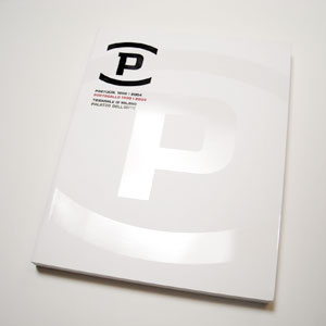
Designed for the exhibition “P”, which featured a selection of Portuguese design and architecture in Milan. On a white background – a metaphor for a territory of creative thought and production still relatively unknown to the Italian audience – a P was inscribed in uppercase. This character, merging a humanistic and a non-seriffed alphabet, is reminiscent of a distinct point of view, which is in itself also a journey.
Designed for the exhibition “P”, which featured a selection of Portuguese design and architecture in Milan. On a white background – a metaphor for a territory of creative thought and production still relatively unknown to the Italian audience – a P was inscribed in uppercase. This character, merging a humanistic and a non-seriffed alphabet, is reminiscent of a distinct point of view, which is in itself also a journey.

")